Project Scope
Create new Squarespace site and migrate relevant content from old site
Redesign layout, look, and flow of website
Grow site to encompass new service lines and new content
Increase service line SEO visibility, web traffic, lead generation and user experience
Update content site wide including blogs, webinars, promo videos, time sensitive banners, etc.
Review web analytics to create action plans to decreased bounce rates, increase conversion rates and UX design
Design Concept
Standout from the "cold" blue and white dominant healthcare industry look
Incorporate new colorful company branding and move away from old red, black, and white branding look
Create modern, clean, borderless look
Bridge old and new site user preferences together by creating pages with longer layouts for mobile and more modern user preference, but also layered and conscious of "above the fold" for more traditional web users
Focusing on HRG's three core strengths, people, process, and technology throughout the design
Encompassing company voice, passions, and motto of "work hard, have fun, make a difference"
Engage with new generation of decision makers
Homepage Design
Before
After
Key Changes
Page layout redesigned for better user-experience. Service lines organized and rebranded to client-centric terminology and logic versus internal company terminology and department structure.
Keeping with branding, but giving warmer look and feel, to get away from cold (blue/white) feel.
Balanced negative space, condensed call to action and descriptions, and led with bright branded visuals. Earning the "read" on second layer pages.
Added contact form and all social connect buttons at bottom of page.
Homepage Navigation
Before
After


Key Changes
Clearer navigation tailored to client-based logic.
Fewer hidden main pages and responsive header menu.
Service Line Overview
Before
After
Key Changes
Lead with industry known service line instead of company specific, trademarked name of location service is performed.
Direct links to individual service offerings inside the PFS service family, versus short descriptions of a variety of items, but no direct link to individual pages.
Contact form with call to action.
Service Line Pages
Before


After

Key Changes
Responsive page design.
Updated headers utilizing brand colors, individual service line icons, and the HRG "swoop" from pinwheel in company logo.
More detailed information on service line to better inform and influence buyer's decision, but more concise for ease of read.
Increased SEO with new page layout, page naming convention, and useful-keyword-rich-content.
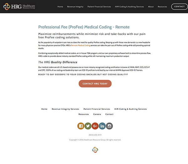
New Service Line Pages


About Pages
Before


After


Key Changes
Show the spirit and people of HRG by doing an in-house photo shoot and using their own employee-owners as the "face" of HRG.
Broke-up clunkier paragraphs to make pages more approachable.
New banner and page layout design implemented to keep consistency of vibrant branding colors and a friendly voice and feel throughout.
Increased user-expereince for job seekers.
Blog & Webinar Pages
Before


After


Key Changes
Added "Resource Library" overview page with easy navigation to webinars, blogs, events, and success stories.
Combined separate blogs into one blog to better tailor experience to company's main decision makers interested in content across all areas of the revenue cycle, and increase RSS subscribers versus splitting them over multiple blogs.
Reformatted blog format for ease of read and decreased page bounce rates.
Optimized webinar overview and post pages, turning webinars in to top four lead generators on website.
New Team Pages


Additional New Pages


